© 2025 Qi Shi. All Rights Reserved.

In my current role, I frequently encounter information displays from various suppliers. However, many of these products provide only basic information and fail to adequately address the diverse needs of different users. Additionally, the main issue with these displays is unclear design, which often confuses users.

There are many applications for passenger information displays in public transport systems. While some perform well and cover everything you can imagine, my research revealed common shortcomings: the content and information displayed are often limited, and reminders are not sufficiently clear or timely.
These limitations in information display make certain guidance operations difficult. One of the most significant challenges is accurately finding the next connecting vehicle. Imagine trying to locate specific information among numerous items on the display! The fact remains that passengers heavily rely on these displays during their journeys.
There is still a significant gap and an opportunity to enhance the user experience. The goal is to reduce the time passengers need to find important information on the display and to make the user experience simple and seamless.

I conducted five user interviews, and although I wish I had more participants, I still gained valuable insights into the public transportation experience.

Based on the information I collected, I built our personas to represent potential users.

Following my research, it became clear that users seek more than just route details. They also need information about train cars and platforms to ensure a seamless journey and arrival.
Following my research, it became evident that users seek more than just route details. They also require information about train cars and platforms to ensure a seamless journey and smooth arrival.

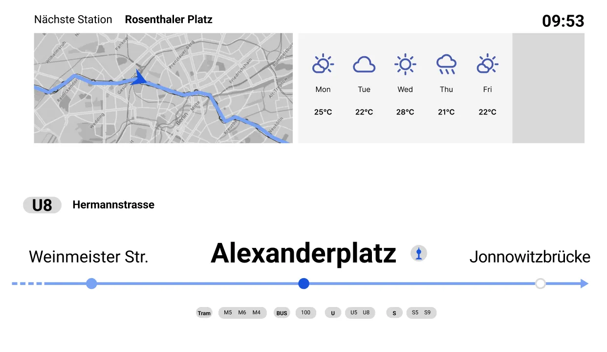
Based on the information architecture, a daily itinerary and U-Bahn route for users have been outlined. The journey begins at the Berlin Wall (Bernauer Station), includes a stopover at the Berlin Television Tower (with a transfer at Alexanderplatz), and concludes at the Brandenburg Gate.
The stages of the journey, in order of travel time, are as follows: train arrival, imminent departure, traveling, approaching a station, and arrival/transfer.


Designing icons for the display system was a valuable experience for me. A minimalist aesthetic was applied, with consistent design elements to maintain uniformity. I prioritized consistency in stroke weight, symmetry, and spacing to achieve a harmonious look and feel across the entire icon set.
I iterated on the designs to ensure they aligned with the system's visual language.


